
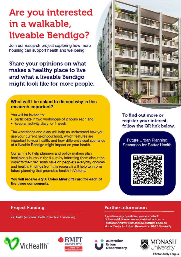
We’re inviting Bendigo residents to join our research exploring how more housing can support health and wellbeing.
What’s involved?
✅ Participate in 2 workshops of 2 hours each
✅ Keep an activity diary for 1 week
✅ Receive a $50 gift voucher for each of these components
Interested?
To find our more or register your interest, scan the QR code above or click here.
Please register your interest by Monday 27th July, 2026.

Photograph: David Crosling/AAP via The Guardian
Extreme heat is one of Australia’s most dangerous natural hazards and it’s getting worse. As the federal government warns of rising heat-related deaths linked to climate change, our new national data reveals which neighbourhoods across Australia are most at risk and why.
A New Lens on Heat Risk
The Heat Vulnerability Index, developed by RMIT researchers, brings together a rich mix of datasets to paint a clear, suburb-by-suburb picture of heat risk across 21 major Australian cities.
This pioneering index combines:
Satellite land-surface temperature readings, revealing where heat builds and lingers.
Heat-sensitive population data, including very young children, older Australians, and people living with chronic health conditions or disabilities.
Socioeconomic factors like income and education, which shape a community’s ability to adapt and cool homes safely.
Built environment and green space measures, which affect how heat is absorbed and dissipated.
– Heat-sensitive population data, including very young children, older Australians, and people living with chronic health conditions or disabilities.
– Built environment and green space measures, which affect how heat is absorbed and dissipated.
– Socioeconomic factors like income and education, which shape a community’s ability to adapt and cool homes safely.
The result? A multi-layered map of risk that goes well beyond temperature alone.
What the Data Shows
The findings are striking:
– Western Sydney and Melbourne’s outer suburbs, including areas like Brimbank, record the highest vulnerability, amplified by limited tree cover and strong urban heat-island effects.
– Adelaide, Hobart, Launceston and Albury also contain surprising hot spots, proving heat risk is not confined to traditionally warm climates.
– Inner-city pockets such as Melbourne’s Carlton and Fitzroy and Sydney’s Woolloomooloo and Rushcutters Bay rank 5/5 for heat vulnerability. Even though these areas are relatively affluent, their built form and high proportion of older residents drive sensitivity.
Understanding Heat Sensitivity and Adaptive Capacity
The Heat Vulnerability Index is more than a single score.
It includes two key dimensions:
– Heat Sensitivity – How susceptible a community is to the effects of heat, based on age, health conditions, population density, and the local built environment.
– Adaptive Capability – A measure of how well people can respond, including the ability to afford cooling or access green space and community support.
These layers reveal that vulnerability is not solely about income. Wealthy neighbourhoods with a high concentration of elderly residents or poor building design can be just as exposed as lower-income suburbs.
Why It Matters for Cities and Policy
Heat is already a major health issue. Research shows that heatwaves caused more than 1,000 deaths in Australia between 2016 and 2019, with higher mortality in communities with older populations and lower incomes or education.
The AUO data underscores the urgency of integrated urban planning. Governments typically manage health, housing, environment and infrastructure separately. But extreme heat cuts across all these sectors, demanding coordinated action on:
– Urban greening and tree canopy expansion
– Cool building materials and design
– Access to affordable, reliable cooling and health services
“Planning is the major challenge,” says Associate Professor Qian (Chayn) Sun, who developed the index.
“We need an integrated approach to designing liveable, climate-resilient places.”
Explore the Heat Vulnerability Index
AUO’s interactive maps put this critical knowledge into everyone’s hands – planners, councils, researchers and communities. You can explore your neighbourhood’s heat vulnerability and adaptive capacity directly on our platform and use these insights to drive real, evidence-based action.
Discover the Heat Vulnerability Index and map your city today
Read the full article here.
About the Australian Urban Observatory
The Australian Urban Observatory, based at RMIT University’s Centre for Urban Research, translates complex urban data into accessible, map-based insights. By combining over 70 liveability indicators across nine domains, AUO supports healthier, fairer and more sustainable cities.
In an era where urbanisation is rapidly transforming our cities, the need for sustainable, liveable, and healthier communities has never been more critical. RMIT University, in collaboration with government and industry partners, is at the forefront of this transformation through an innovative data-sharing project. This initiative, led by Professor Melanie Davern, aims to leverage data to enhance the liveability of urban developments.
The Australian Urban Observatory (AUO)
The Australian Urban Observatory (AUO) is a digital platform developed by RMIT’s Centre for Urban Research. It aggregates detailed insights to drive tangible improvements in urban liveability. The AUO maps public health data across various criteria, including: walkability, public transport, social infrastructure and services, employment, food, housing and public open space.
These indicators are meticulously chosen for their association with health outcomes and alignment with government policies. The platform serves as a national resource, enabling the identification, measurement, monitoring, and targeting of responses to critical social, economic, and environmental challenges.
Impactful Partnerships
One of the key strengths of the AUO is its collaboration with industry partners. A notable example is the ongoing partnership with Stockland, Australia’s largest diversified property group. This collaboration has been instrumental in informing Stockland’s approach to creating and measuring social impact within its communities.
Justine Felton, Group Social Sustainability Manager at Stockland, emphasised the importance of an evidence-based approach to social impact. The AUO data has been integrated into Stockland’s Social Needs Analysis and Social IQ tools, helping to better identify community needs and measure social value.
Broader Projects and Initiatives
Beyond its partnership with Stockland, the AUO is involved in several other projects aimed at improving city planning and liveability:
Cycling Infrastructure: Funded by The Ian Potter Foundation, the AUO is developing cycling indicators to enhance urban cycling infrastructure nationwide.
Municipal Public Health: In collaboration with Victorian local governments, the AUO is producing monitoring and evaluation tools to support municipal public health and wellbeing planning.
Healthy Ageing: The Healthy Ageing Discovery Project focuses on refining neighbourhood designs to support ageing in place, considering socioeconomic factors and personal preferences to enhance liveability for older populations.
The AUO exemplifies how data can be harnessed to drive meaningful improvements in urban liveability. Through strategic partnerships and innovative projects, RMIT and its collaborators are paving the way for healthier, more sustainable communities. As cities continue to grow, initiatives like the AUO will be crucial in ensuring that urban development meets the needs of all residents.
Read the full article here.
Authors: Kate Milkins and Aeden Ratcliffe
This blog post highlights the significant strides being made in urban liveability through data-driven initiatives. If you have any questions or would like to learn more about the AUO, contact us here.

Launched in March, Swim Melbourne is a map of places to swim across the city. Responding to both growing interest in pool and outdoor swimming, as well as to the national drowning rates, Swim Melbourne hopes to provide useful information about safety and water quality, as well as stories of urban swimming in pools, the Yarra and Port Phillip Bay. Grounded in a framework of human environmental health and wellbeing, the map includes places that are accessible for all levels of swimmers, with information about costs, lessons, and opening times available for relevant sites. Produced by a team from the Centre of Urban Research at RMIT University, Swim Melbourne aims to be a valuable resource for swimmers and policy makers alike.
For more information on the project, contact Rebecca Olive in the RMIT Centre for Urban Research: rebecca.olive@rmit.edu.au
Growth Areas Liveability Scorecards were developed in partnership between the National Growth Areas Alliance and the Australian Urban Observatory. The main aim was to investigate and communicate the liveability of Growth Areas in comparison to other areas of capital cities. Growth Area Liveability Scorecards are available for Adelaide, Brisbane, Melbourne, Sydney and Perth and include comparison of liveability indicators between Growth Areas, non-growth areas and the overall city averages. All results are based on previously released Australian Urban Observatory 2021 city-level liveability scorecards, while Growth Areas Liveability Scorecards can be downloaded from the map below.
Growth Areas are defined as the fastest growing Local Government Areas in the outer metropolitan regions of capital cities and spill over peri-urban regions on the fringe of these cities. The areas are characterised by rapid annual population growth, with a high proportion of young families in new residential urban development. These Growth Areas of interest have experienced this type of development in either the past 20 years, or are expected to see rapid growth in the next 20 years.
City Scorecards provide observation to support understanding and further action. The reports highlight liveability inequity across Australian cities that includes areas with high liveability and areas where liveability could be enhanced through targeted liveability policy and planning action. Additional information on the liveability indicators included in the Growth Area Liveability Scorecards is available here and detailed suburb and neighbourhood liveability results can be visually explored via the Australian Urban Observatory map.
To read about the Growth Areas Liveability Scorecard findings, visit: https://auo.org.au/impact/
The Australian Urban Observatory at RMIT University is delighted to invite you to the online launch of the new and improved AUO Map 2.0 on Tuesday the 10th of September at 1pm.
During Social Sciences Week, the Australian Urban Observatory team will be releasing an enhanced AUO digital map portal that supports faster, more efficient and insightful observation and understanding of city liveability across Australia. Our new and improved portal reflects the ongoing contribution of our research partners, without whom, our expanded work would not be possible.
Emeritus Professor Barbara Norman is our esteemed guest speaker at the launch and Chair of the National Urban Policy Forum. Professor Norman is a global expert in sustainable cities and regions, smart infrastructure, coastal planning, climate change adaptation and urban governance. Professor Norman will present the Australian Government’s Draft National Urban Policy that has recently been open for public consultation with goals and objectives that support urban areas to be liveable, equitable, productive, sustainable and resilient.
Join us for an informative, interactive session and learn more about how the AUO Map 2.0 can serve you even better!
Speakers:
Emeritus Professor Barbara Norman, University of Canberra, Chair National Urban Policy Forum
Brigid Papaix, Partnerships Manager & Knowledge Broker Australian Urban Observatory, RMIT University
Professor Melanie Davern, Director Australian Urban Observatory, RMIT University
This event will be held online via Microsoft Teams. An online access link will be emailed on the day prior to the event. Registrations will close on the 9th of September at 5:00pm. Click here to register.
We are thrilled to share a sneak peek of the enhancements that are coming to the Australian Urban Observatory Map, designed to elevate your user experience and provide even deeper insights into the liveability of Australian cities.
Faster Navigation
We’ve made it easier to get the liveability data you need with upgrades to increase the map speed and adding new navigation features.
You can search by address to quickly find a specific location or simply drag and zoom the map to explore different areas.
Neighbourhood Walking Distance
One of the exciting new features is the Walking Distance tool.
This feature utilises the road network to calculate the walkability of a neighbourhood. By selecting a walking time (ranging from 10 to 60 minutes) and centre point on the map, you can visualise the area you can cover on foot within that time frame.
Additionally, you can access data on the population within that walking range, including male and female populations and the average household size.
Redesigned Scorecard
The liveability Scorecard has been redesigned to provide a more intuitive way to understand how an area is performing relative to the rest of the country across the nine key domains of liveability. You can also download easy to interpret PDFs, making them ideal for inclusion in reports and submissions.
Thanks to our Partners
These upgrades are the result of close collaboration with our paid partners. Our partners play a huge part in shaping the AUO portal and a faster, more responsive, and easier to use portal ensures that they can access the data they need to enhance liveability across our cities.
You can join this collaboration and access all the features and data available to our partners.
Create an account to access the free version of the AUO portal, empowering you to make informed decisions for our cities’ future, and be the first to see the enhanced AUO portal when it launches.
Meet our Newest Indicators!
With support from the Victorian Higher Education Investment Funding the Australian Urban Observatory (AUO) is excited to launch a new national resource of 24 new Specialist Housing Indicators that address critical housing issues across LGAs, suburbs and neighbourhoods of Australian cities.
The Specialist Housing Indicators have been developed to support our users with:
– directly addressing the current and critical housing issues of relevance to public policy and decision-making across Australia,
– piloting and demonstrating the value of small area spatial analysis, measurement and mapping of critical housing issues to help inform service planning, advocacy and policy intervention and
– Identifying areas of inequity with new specialist housing indicators available at the smallest level of geography available, dependent on data access and availability.
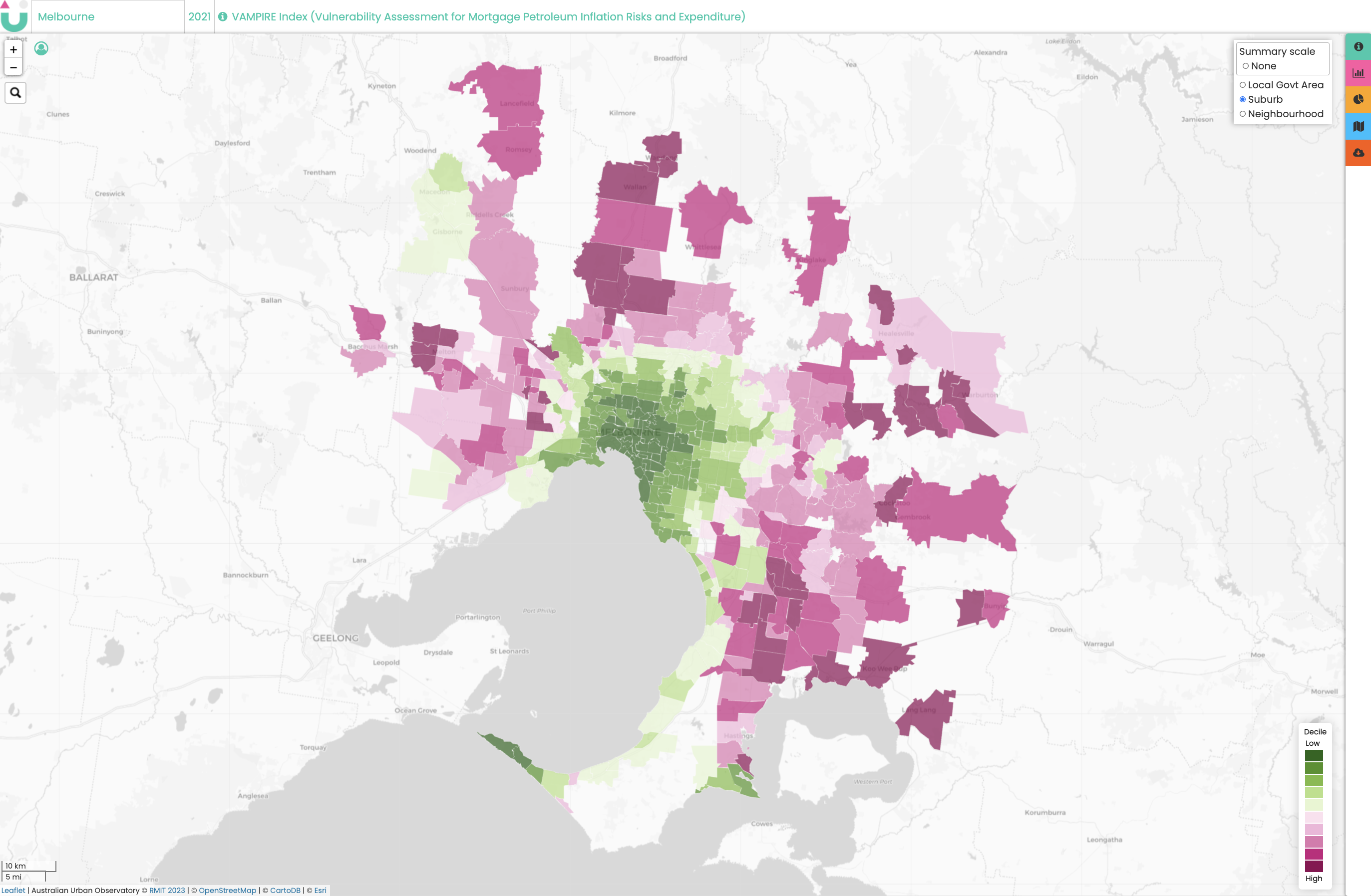
New specialist housing indicators include: housing precarity and gentrification, homelessness service access, VAMPIRE (Vulnerability Assessment for Mortgage, Petroleum, Inflation Risks and Expenditure, Key Workers, housing ownership and costs, social and public housing, and affordable rentals. Full details about all of the indicators and how they have been calculated can be found here.
How to Access the Indicators
The AUO maps 70+ indicators of liveability across Australia’s 21 largest cities. We map to three three levels of detail: Local Government Areas, Suburbs and Neighbourhoods for two time periods, 2018 and 2021. Understanding liveability indicators at this granular level enables partners to see where the inequities are in their community and supports planning and policymaking for community health and wellbeing.
All new Specialist Housing Indicators are FREE to access in the AUO. Indicators for our overall Liveability and Social Infrastructure domains are also available for FREE to all levels of detail.
Suburb and Neighbourhood levels of details for all other domains: Walkability, Transport, Food, Alcohol, Public Open Space, Employment and Housing are available via a paid partnership with the Australian Urban Observatory.
To learn more about liveability of Australian cities and a paid partnership with the Australian Urban Observatory, contact us here.
In conjunction with the Geography Teachers Association of Victoria we have developed some excellent new education resources to support understanding of liveability, urban connections, and geographies of wellbeing for Australian secondary school students.
These resources align with three specific units in the Victorian Geography Curriculum enabling students to explore:
Year 7: Place and Liveability
Factors that influence the decisions people make about where to live and their perceptions of the liveability of places, influence of accessibility to services and facilities; and environmental quality, on the liveability of places, environmental, economic and social measures used to evaluate places for their liveability, comparing two different places, influence of social connectedness and community identity on the liveability of places, strategies used to enhance the liveability of places, especially for young people.
Year 9: Geography of Interconnections
Perceptions people have of place, and how this influences their connections to different places, ways in which transportation technologies are used to connect people to services, information and people in other places and the effects of people’s travel, recreational, cultural or leisure choices on places, and the implications for the future of these places
Year 10: Geography of Human Wellbeing
Reasons and consequences for spatial variations in human wellbeing on a regional scale on a local scale in Australia, different ways of measuring and mapping human wellbeing and development, and how these can be applied to measure differences between places, role of initiatives by international and national government and non-government organisations to improve human wellbeing in Australia
We are excited to share these resources, alongside a supporting Teacher Resource, with teachers and students across Australia. They will be available through the AUO (download here) and GTAV websites.
We are excited to share our new Demographic Indicators to enable better understanding of equity of access to liveable places in your local community. These Demographic Indicators have been mapped with both 2016 and 2021 Census data providing alignment with our 2018 and 2021 Liveability Indicators.
In this first release, we have 115 Demographic Indicators mapped to all three levels of detail – LGAs, Suburbs and Neighbourhoods – including mapping of incidence of disease data which has been collected by the ABS Census for the first time in 2021.
The 115 new indicators include: Age and gender (24), Housing type (7), Diversity (6), SEIFA-IRSD (2), Labour force status (3), Income (5), Housing costs (15), Employment sector (5), Education (2) and Health (46).
You can download our most up to date list of AUO Cities and Indicators here.